
Quick Tips
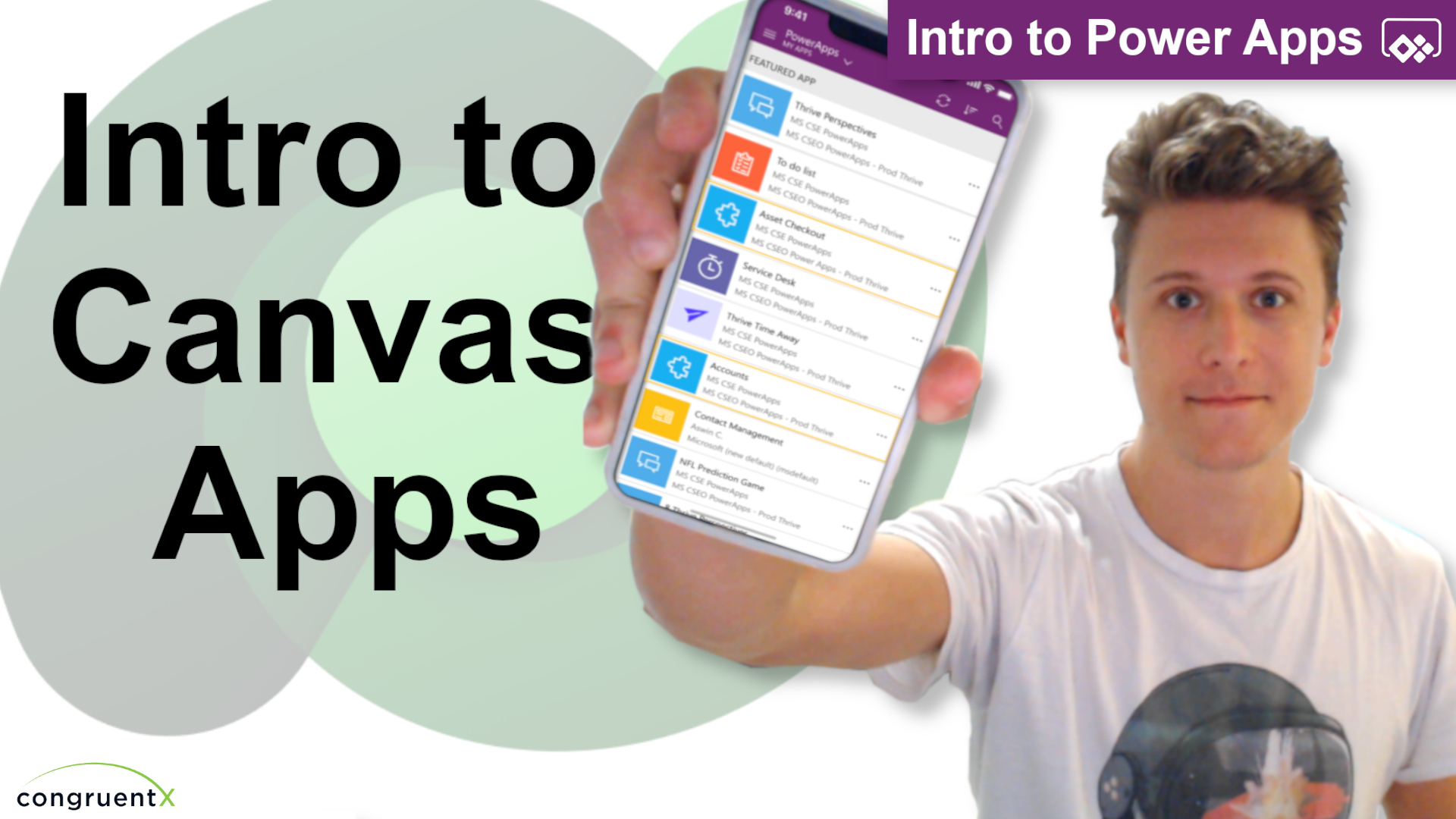
Intro To Canvas Apps
Canvas apps are by far my favorite part of ‘Power Apps’ – I’m a little biased since this is how I was first introduced to Power Apps. Canvas apps are a great solution when your users need some sort of UI that must be mobile. They’re also an ideal solution when you need certain functions/operations to take place that would be cumbersome to implement in a model-app. Do take note this won’t be the case for long – canvas apps and model-apps will soon share the same capabilities.
In this video I go over the basic layout and functions of canvas apps. Let’s start with the layout of the designer/builder:

2. Properties – The properties section is where you’ll find basic properties/settings of whatever element you currently have selected. In the picture above you can see I have “Screen1” selected.
3. Elements – I call this the elements section. This is where you’ll manage all the elements (pictures, labels, controls, components, etc.) in your app. You can also add data sources in this section.
4 Command Bar – We’ll refer to this top section as the “Command Bar”. This area shares functionality from both the properties section and the elements section. You’ll also find app-level settings here. Two key operations are found within the command bar as well (the property selector and the formula bar):
5. Property Selector – This dropdown shows all the available properties of the element you have selected. A common example would be the “Width” or “Height” of a label, gallery, or screen.
6. Formula Bar – The formula bar is where you can use the Power FX language to further control properties. Ex: You can use an If() statement to control the color of a label here.
From here you should have a decent idea of where things are in the canvas app designer. In the video I create a basic app where user’s select a record, navigate to a new screen, and update that record. Please follow along and see what you come up with!